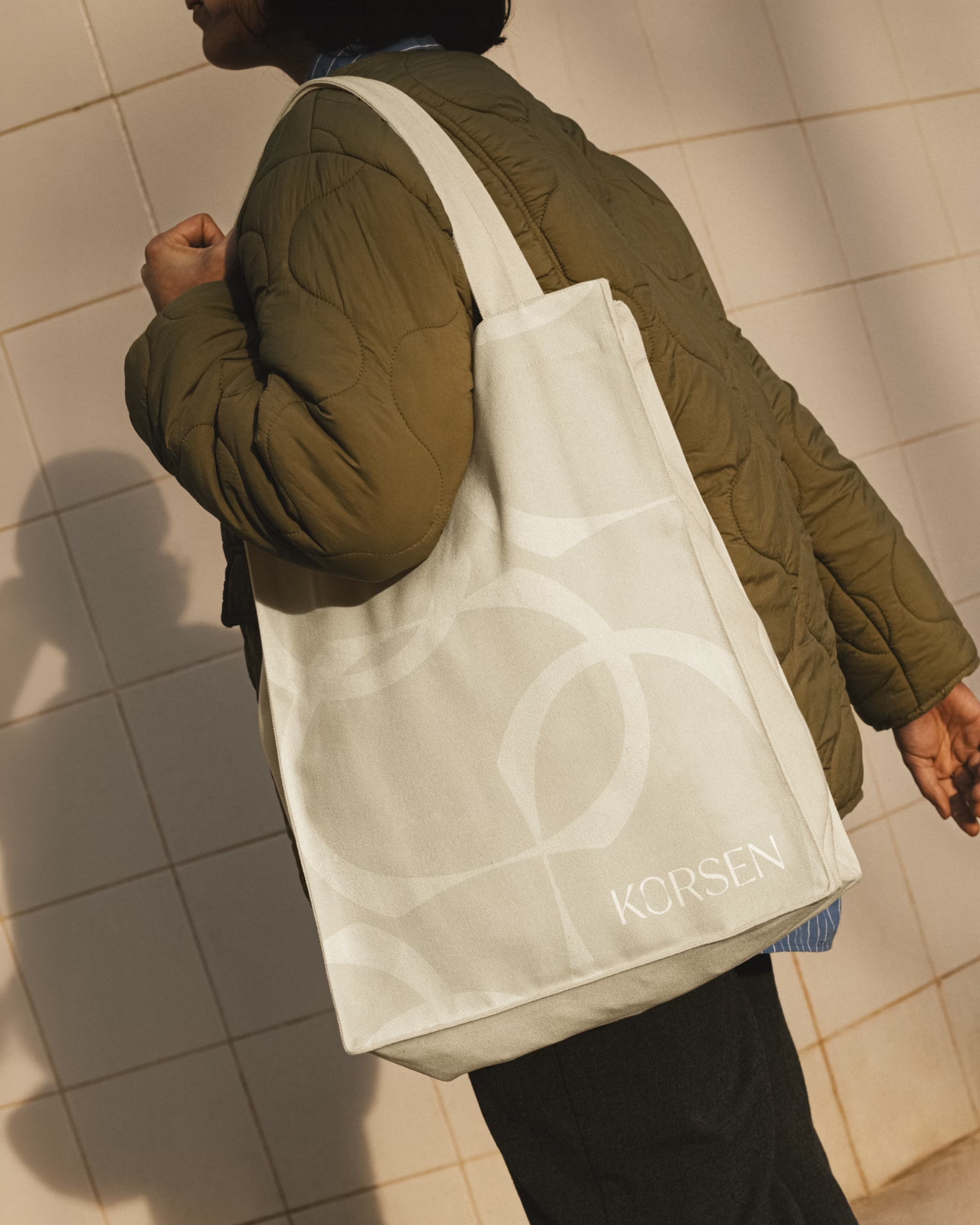
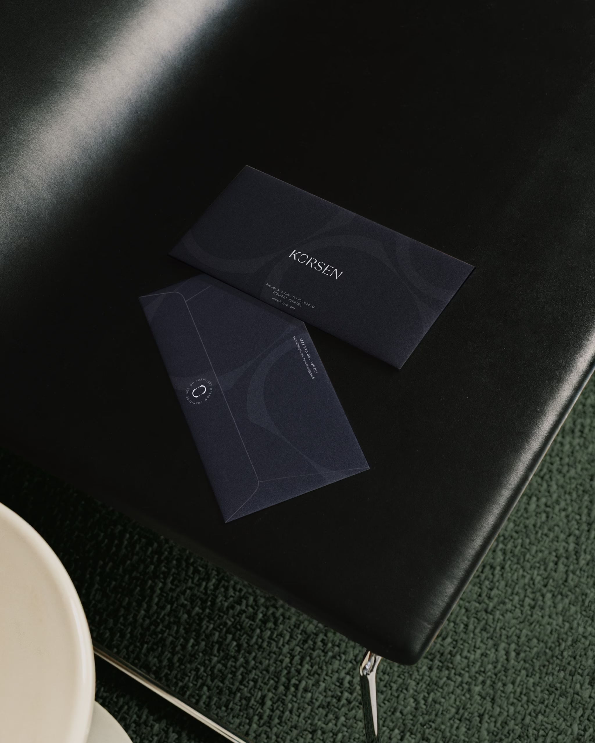
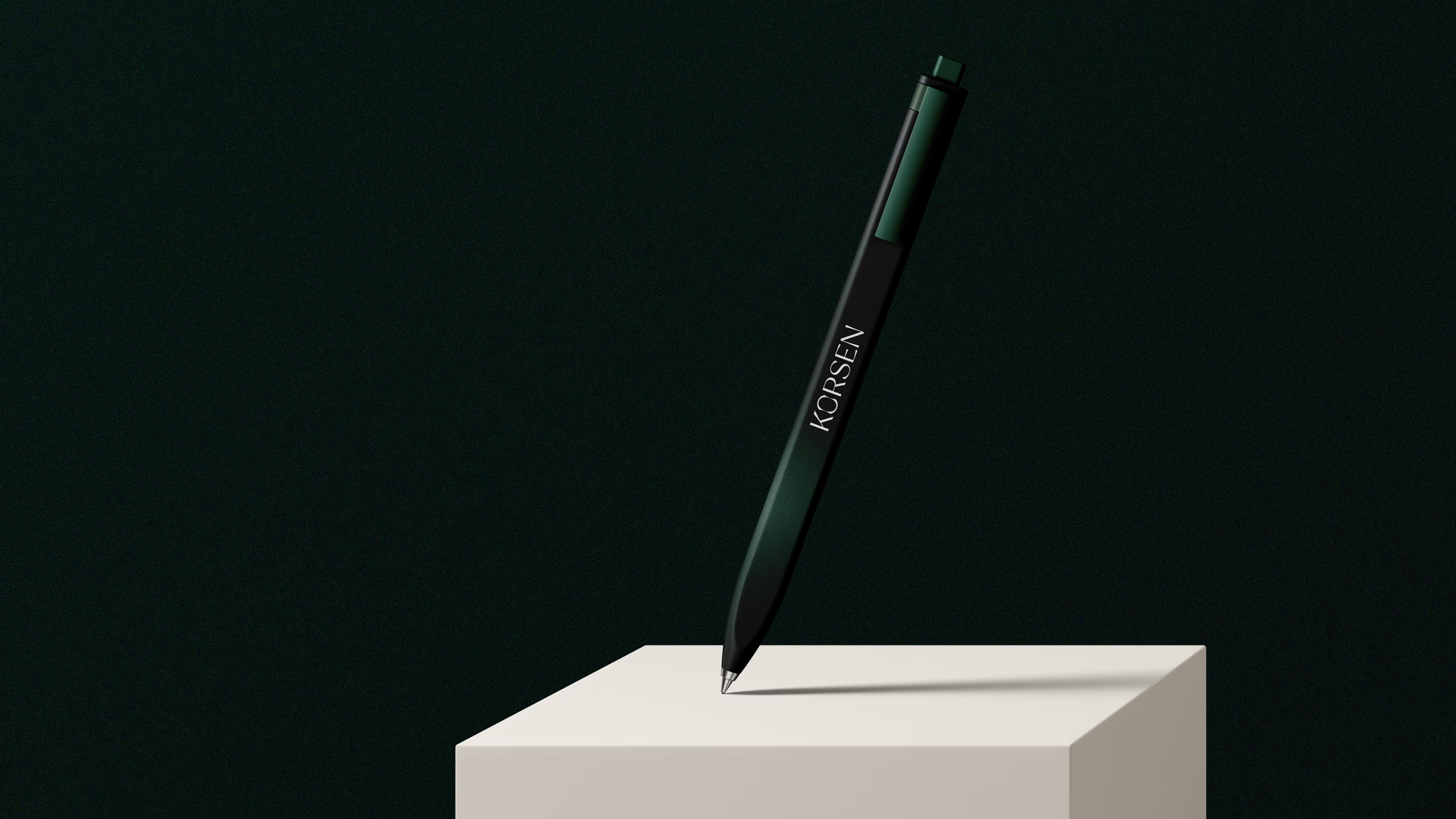
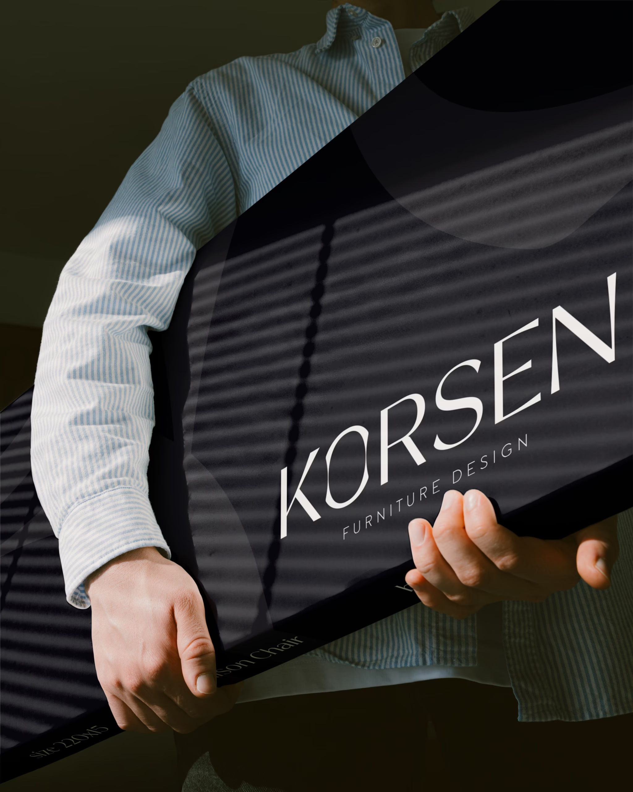
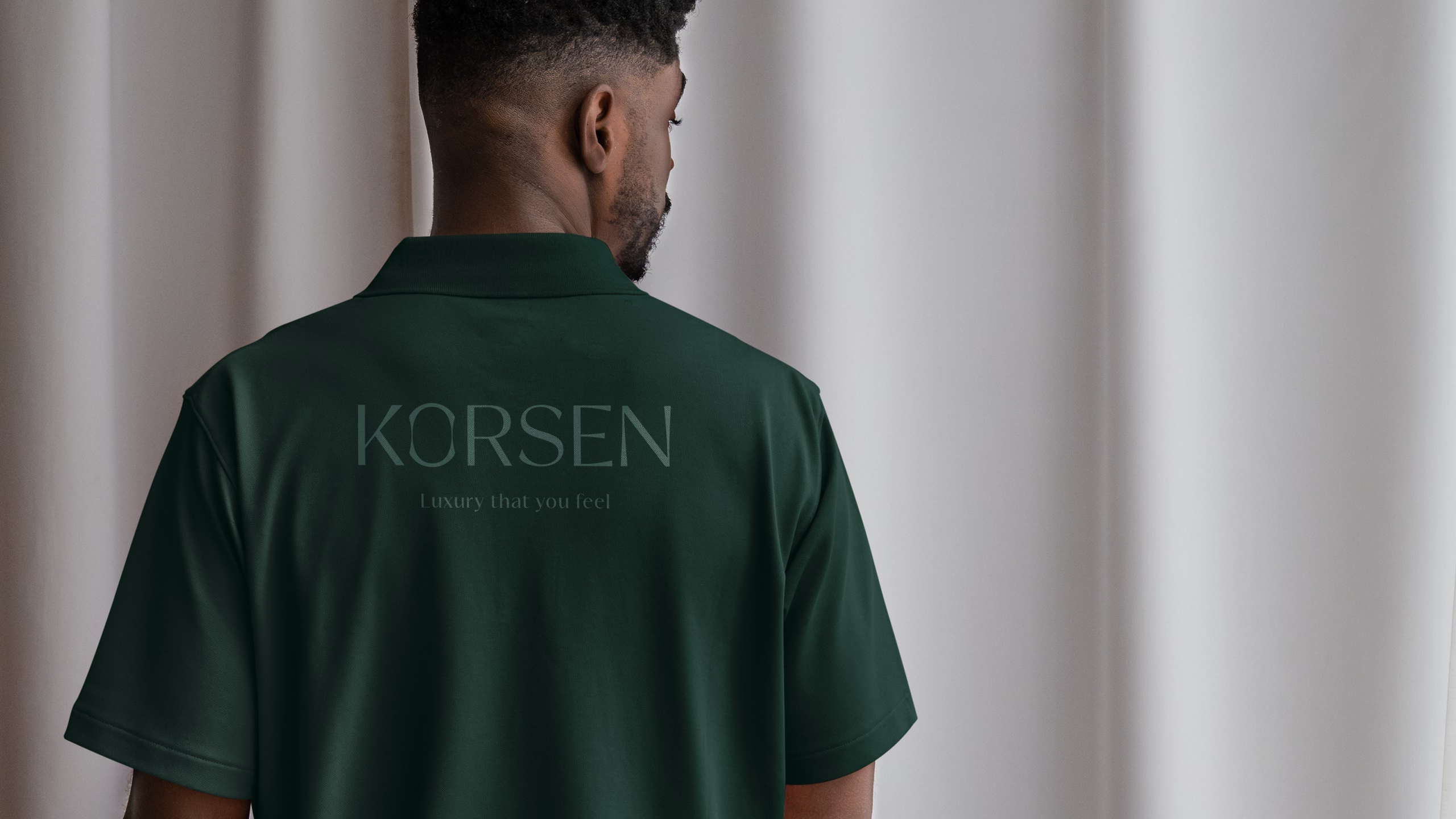
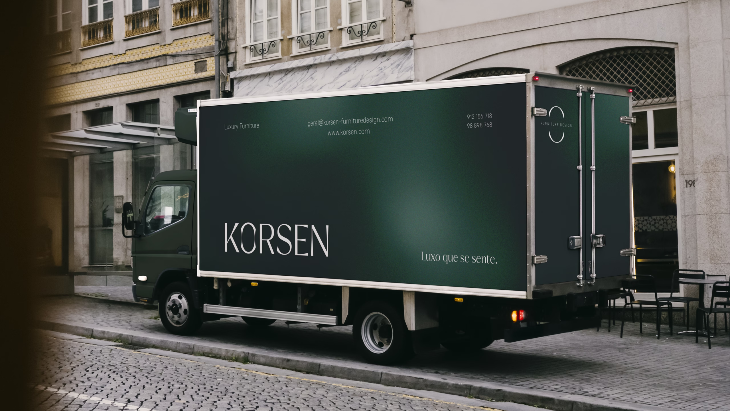
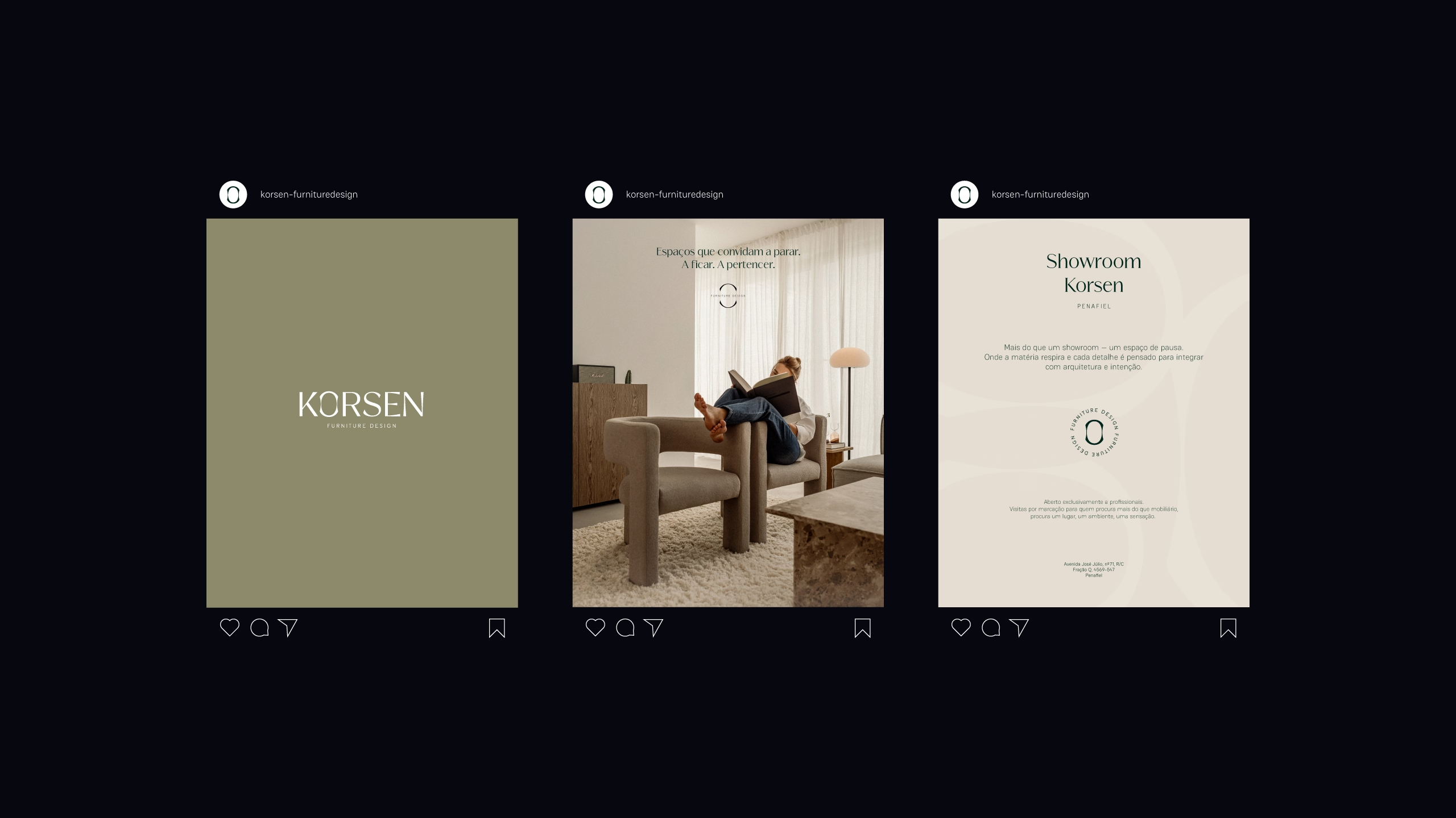
Korsen
Furniture Design
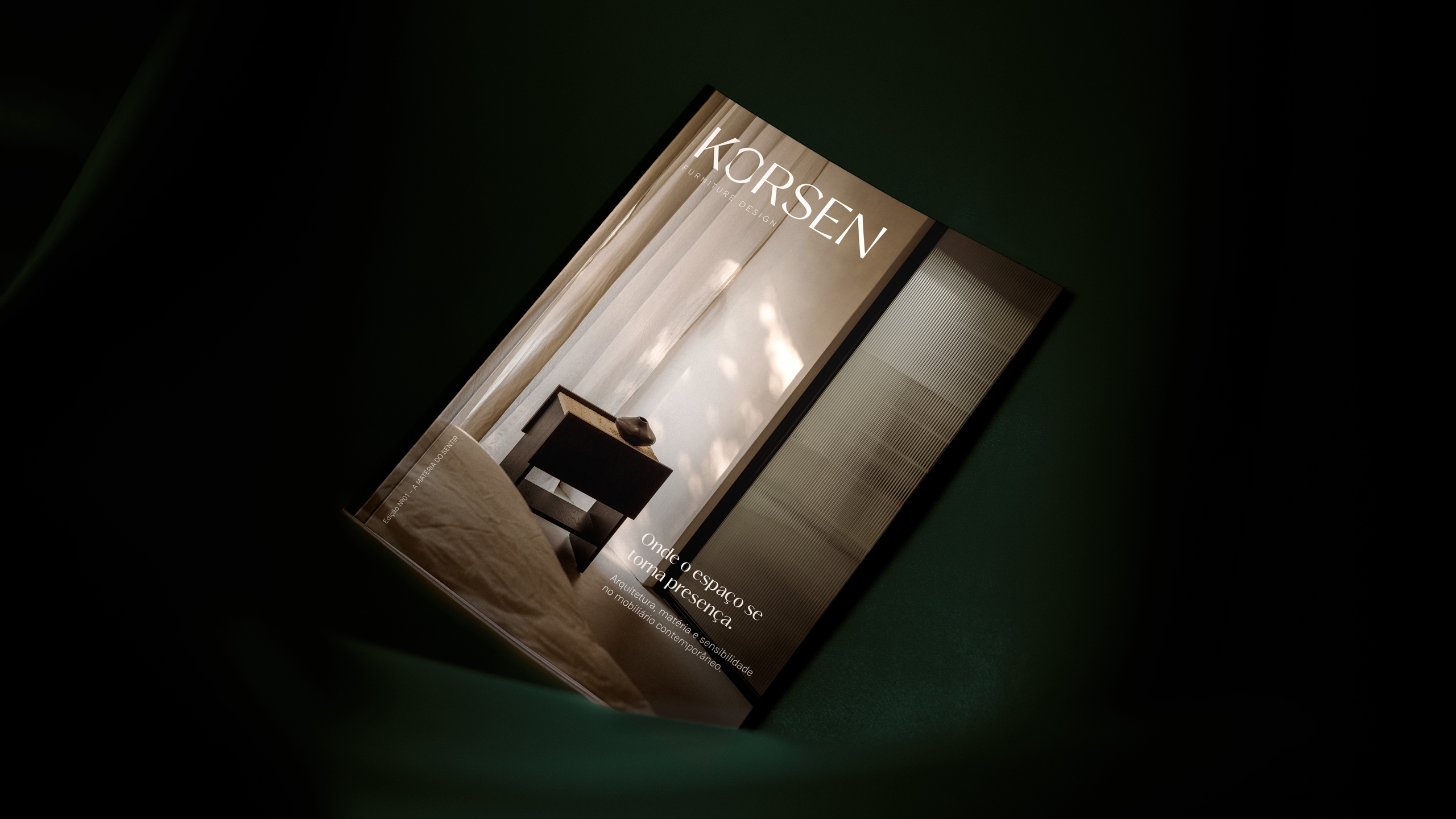
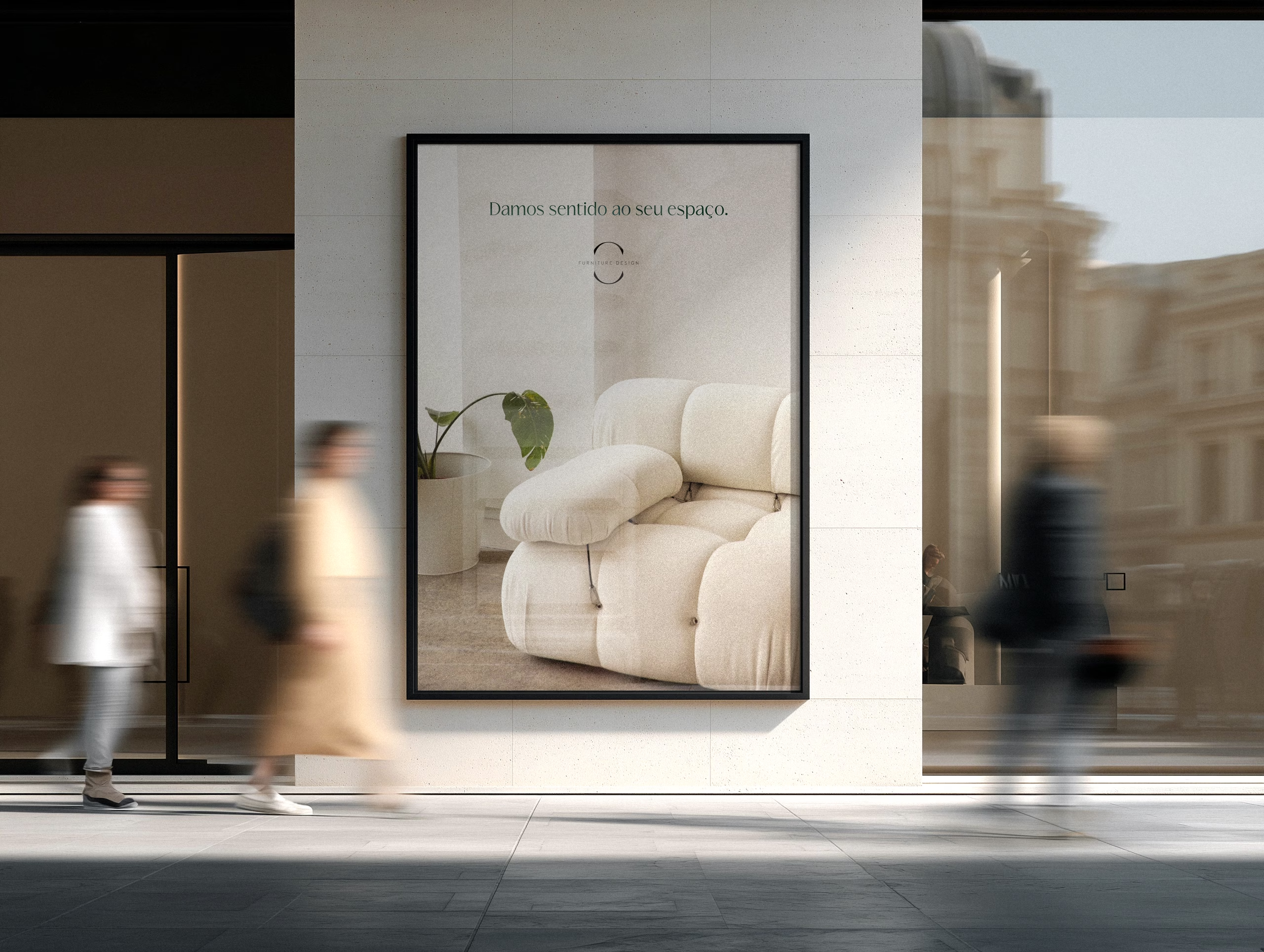
Most furniture brands talk about materials, finishes and craftsmanship. Korsen was created to talk about something different.
It was born from the belief that a home is never just a collection of pieces. It is where we seek comfort, belonging and tranquillity. The place we return to after a long day. Our refuge.
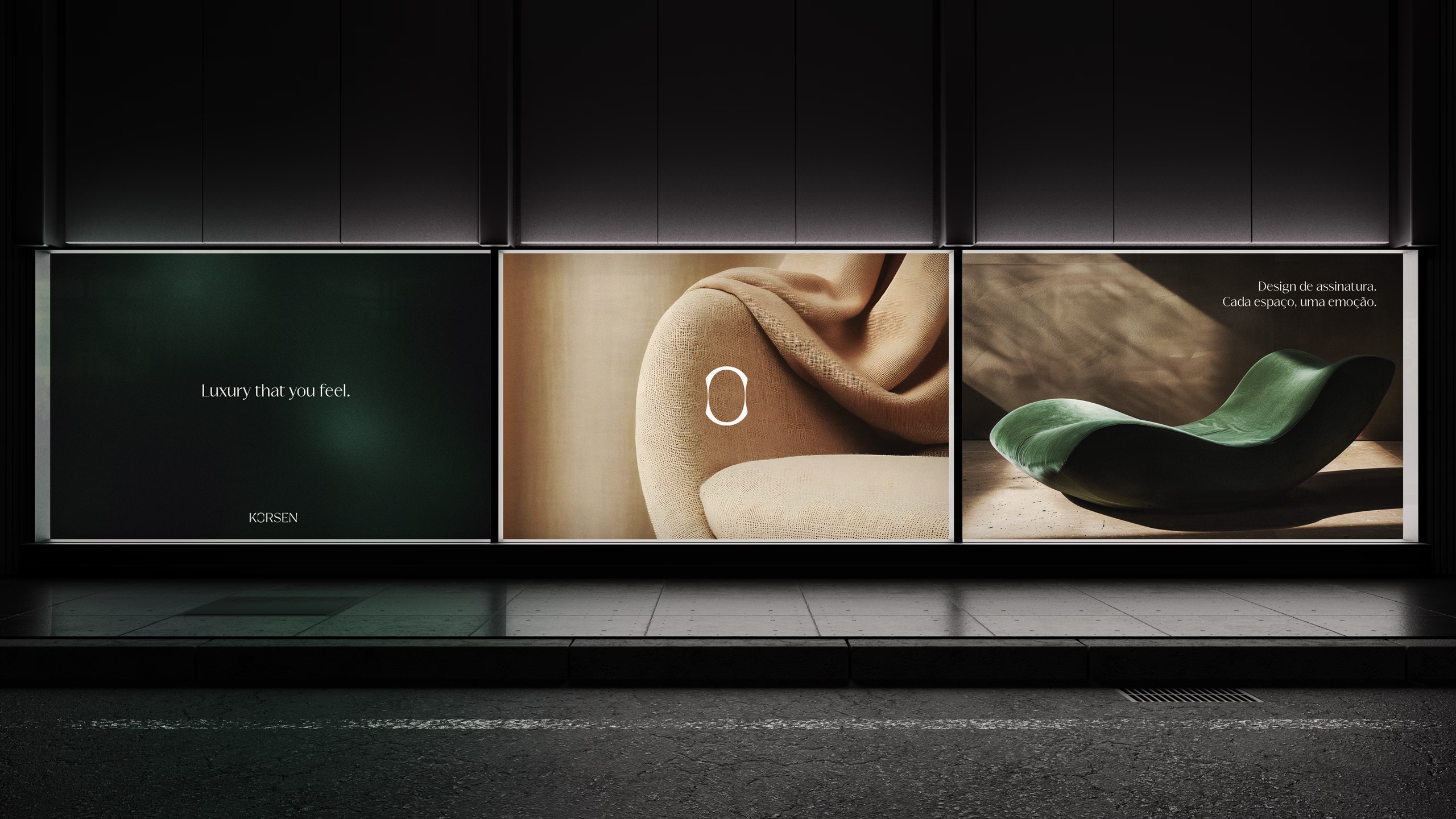
With this idea at its core, the brand strategy positioned Korsen within a territory where luxury becomes more than something visual — it becomes emotional. A kind of luxury measured not only by the quality of materials, but by the ability to transform spaces into experiences and houses into sanctuaries.
More than creating furniture, Korsen aims to create environments that reflect the people who inhabit them and make them feel truly at home.
Most furniture brands talk about materials, finishes and craftsmanship. Korsen was created to talk about something different.
It was born from the belief that a home is never just a collection of pieces. It is where we seek comfort, belonging and tranquillity. The place we return to after a long day. Our refuge.
With this idea at its core, the brand strategy positioned Korsen within a territory where luxury becomes more than something visual — it becomes emotional. A kind of luxury measured not only by the quality of materials, but by the ability to transform spaces into experiences and houses into sanctuaries.
More than creating furniture, Korsen aims to create environments that reflect the people who inhabit them and make them feel truly at home.
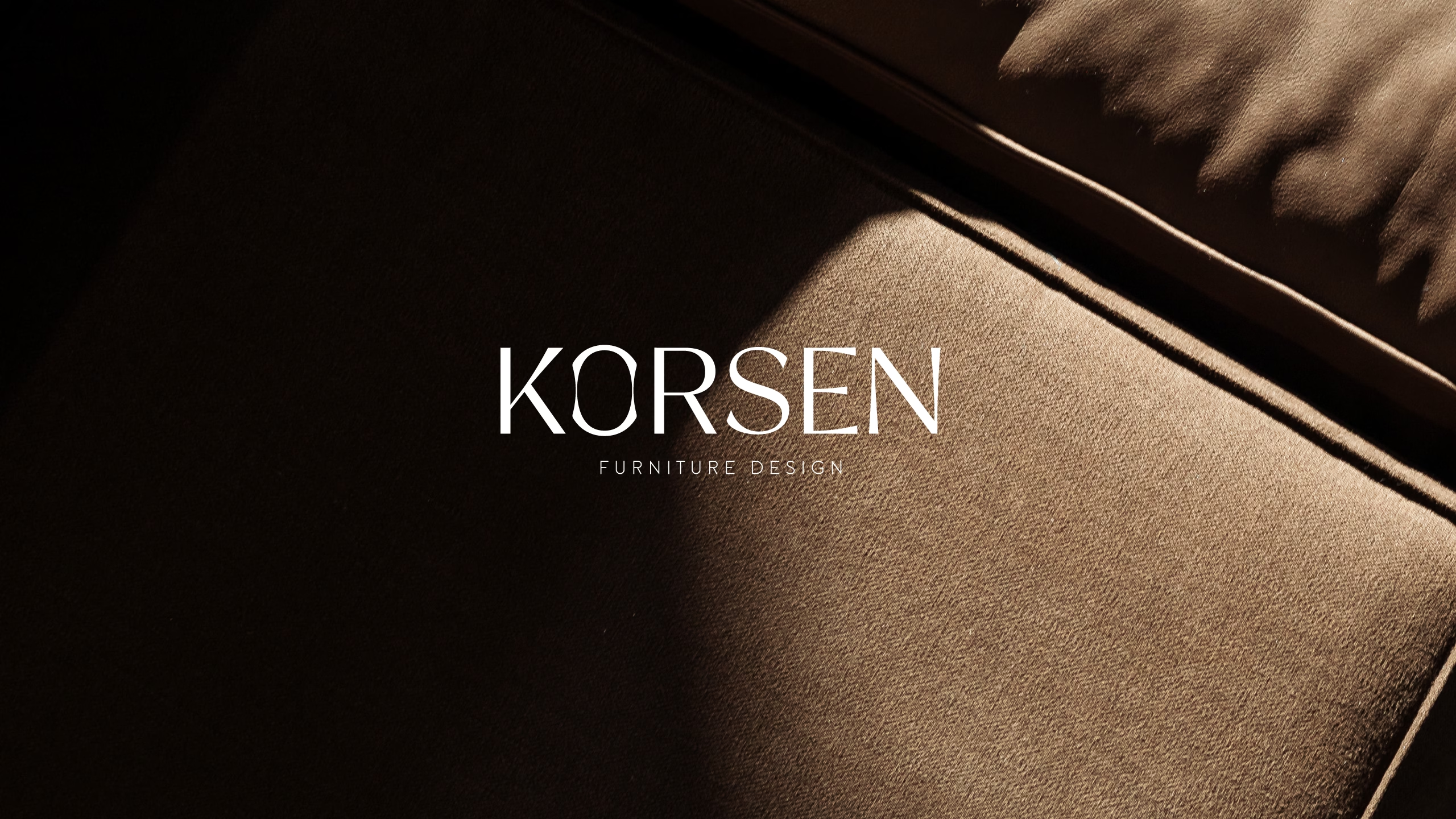
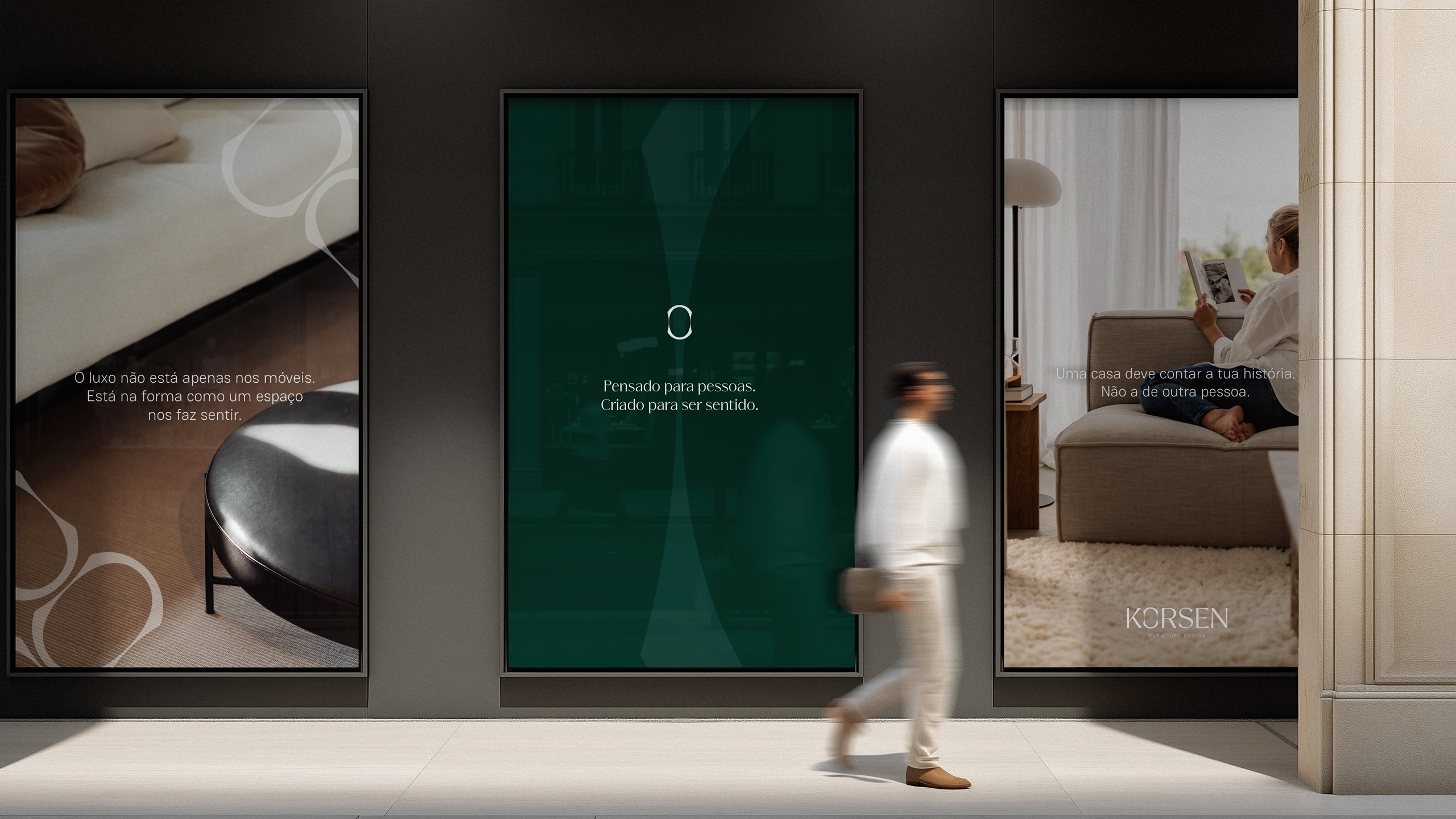
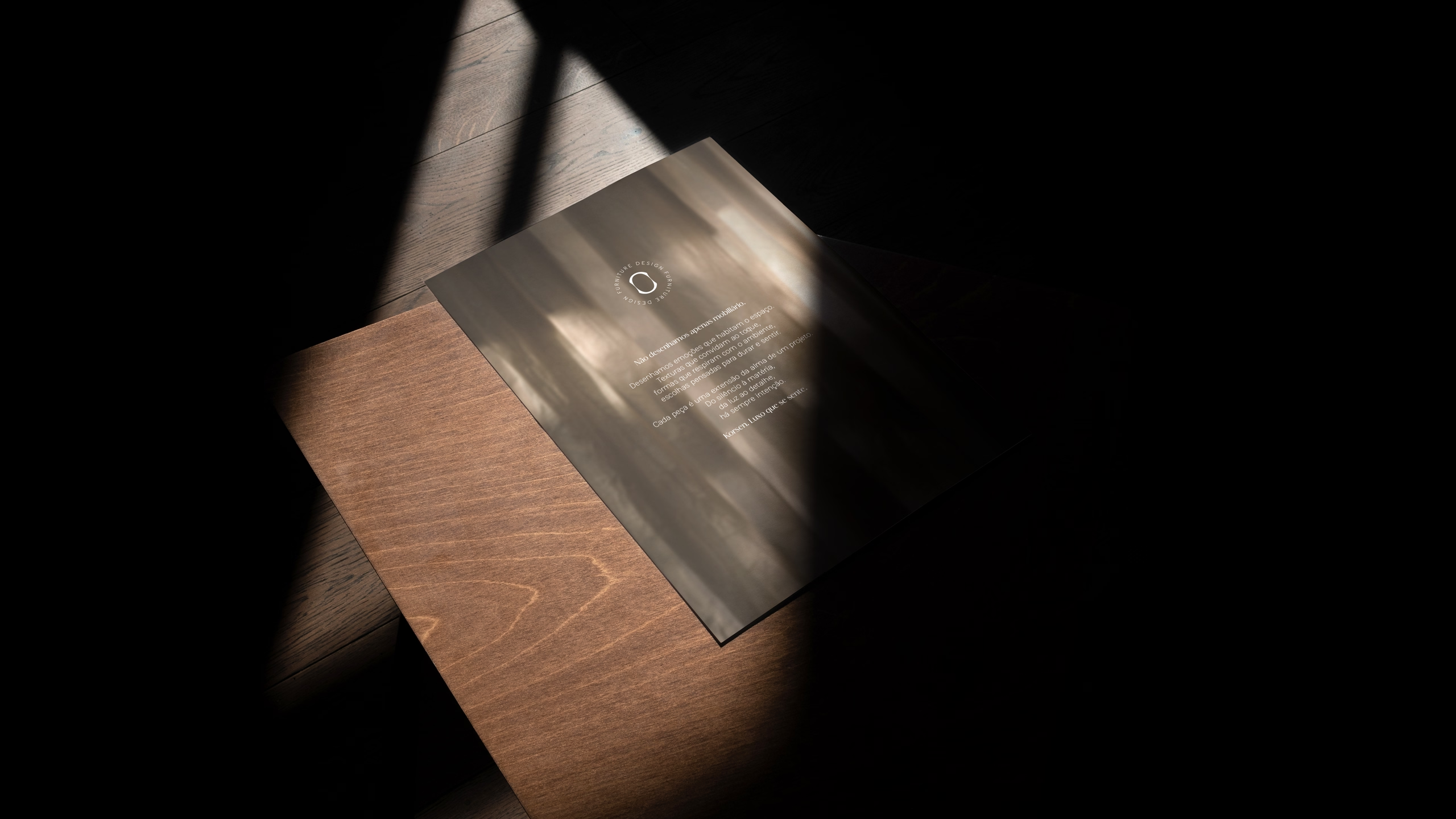
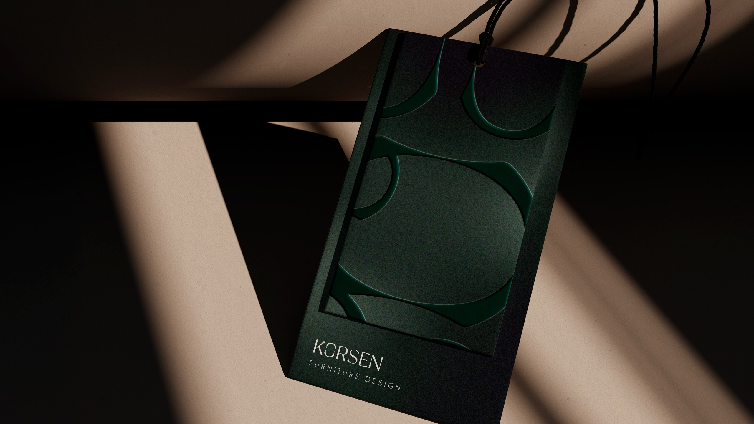
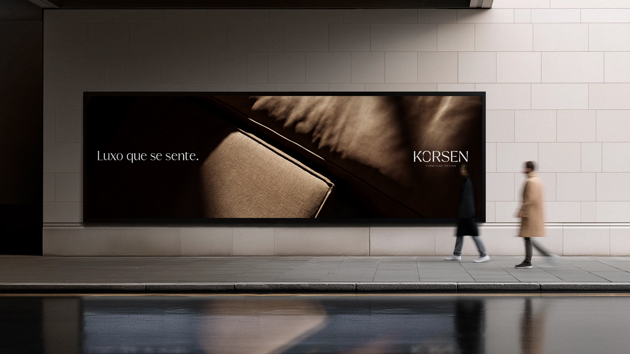
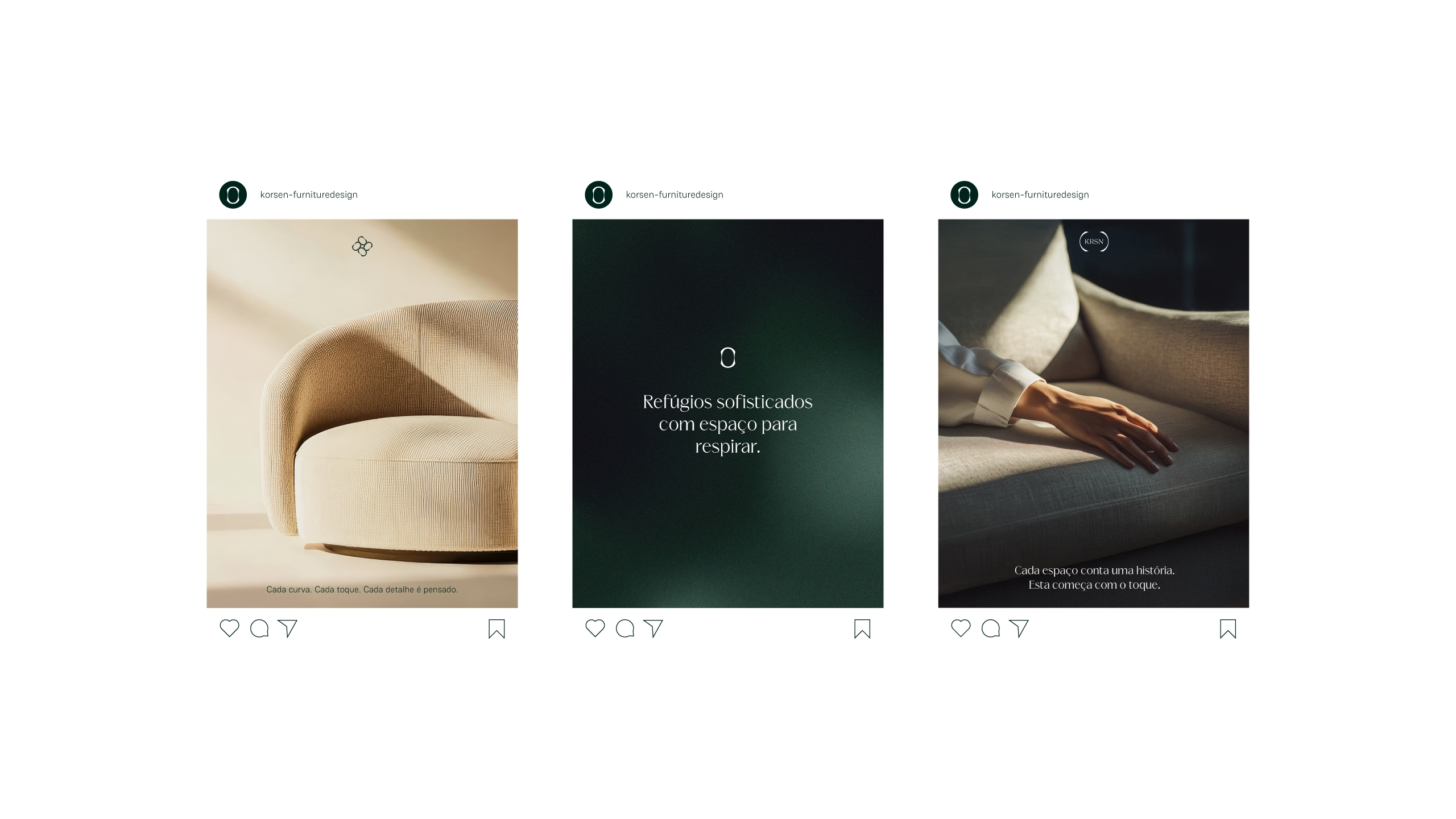
The visual identity was built around a simple idea: true luxury is not only about what we see, but about how a space makes us feel.
Throughout the creative process, one image kept returning — the feeling of being in a place where you can finally take a deep breath. A space that welcomes you, slows the pace and makes you feel at home.
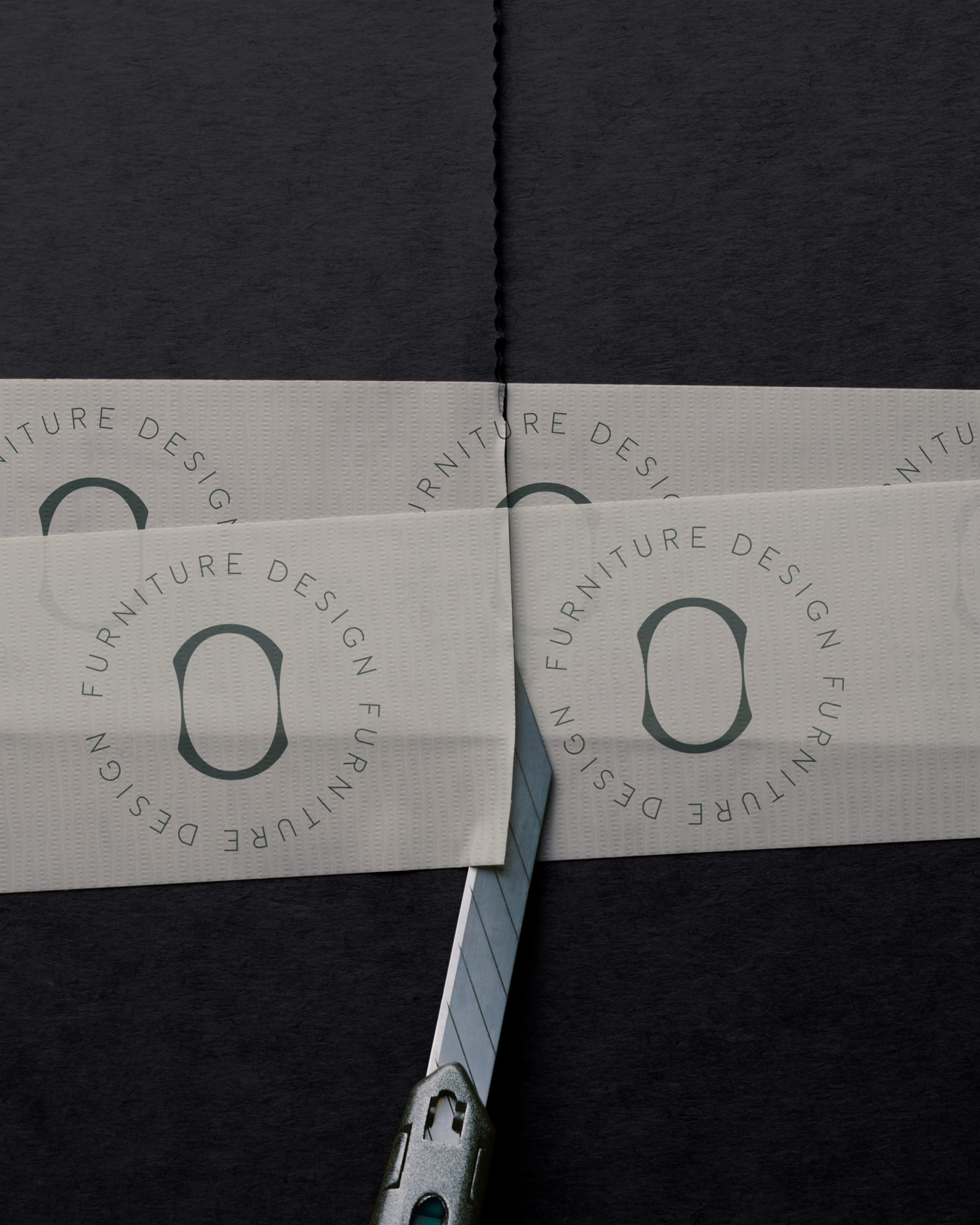
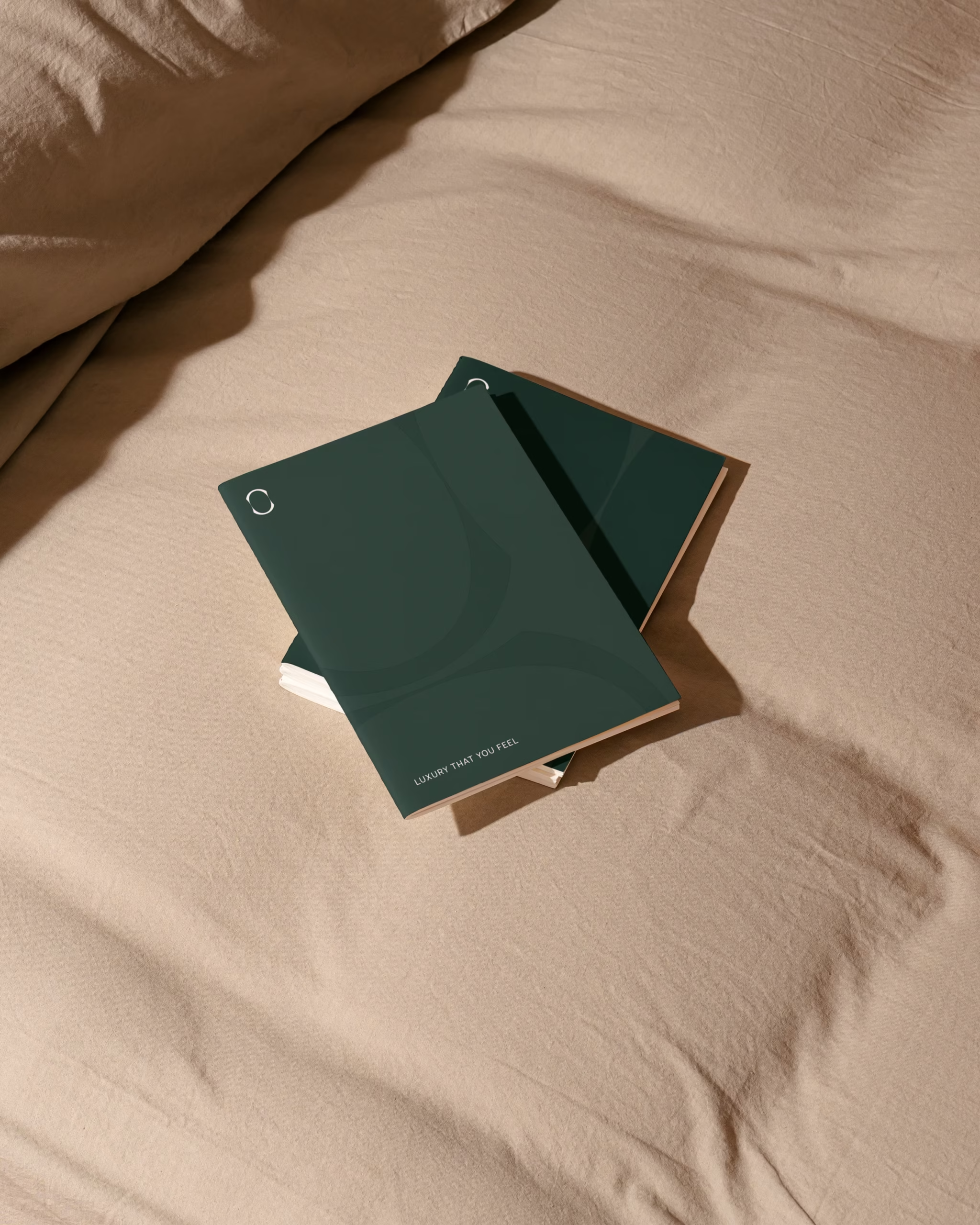
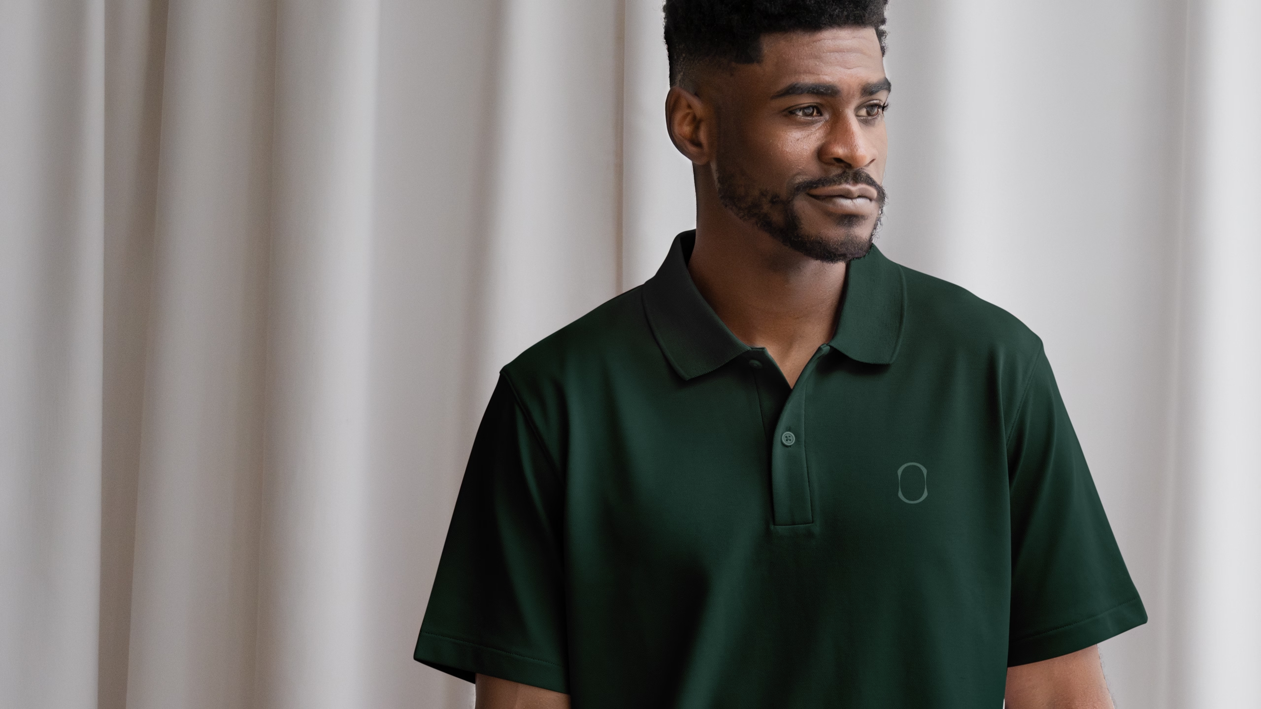
That idea became embodied in the letter “O” of KORSEN.
As the only letter with a fully enclosed form and an interior space, it became the perfect element to represent the emotional and sensory bubble the brand seeks to create through every project.
Its shape was redesigned around the gesture of breathing. Like a body slowly exhaling, the form contracts towards the centre, creating a subtle sense of lightness, relaxation and wellbeing.
More than a graphic detail, the “O” becomes the heart of the identity — a symbol embedded within the logotype itself, translating the essence of Korsen: creating spaces that are meant to be felt.
The visual identity was built around a simple idea: true luxury is not only about what we see, but about how a space makes us feel.
Throughout the creative process, one image kept returning — the feeling of being in a place where you can finally take a deep breath. A space that welcomes you, slows the pace and makes you feel at home.
That idea became embodied in the letter “O” of KORSEN.
As the only letter with a fully enclosed form and an interior space, it became the perfect element to represent the emotional and sensory bubble the brand seeks to create through every project.
Its shape was redesigned around the gesture of breathing. Like a body slowly exhaling, the form contracts towards the centre, creating a subtle sense of lightness, relaxation and wellbeing.
More than a graphic detail, the “O” becomes the heart of the identity — a symbol embedded within the logotype itself, translating the essence of Korsen: creating spaces that are meant to be felt.
Ready to unleash your brand’s true potential to new heights?
Let’s connect, and you’ll find not just a design partner, but a business ally.
Ready to unleash your brand’s true
potential to new heights?
Let’s connect, and you’ll find not just a design partner, but a business ally.
© 2025 Inês Antunes. All Rights Reserved. Privacy Policy
© 2025 Inês Antunes. All Rights Reserved. Privacy Policy